Ecommerce Homepage Examples That Boost Sales Fast
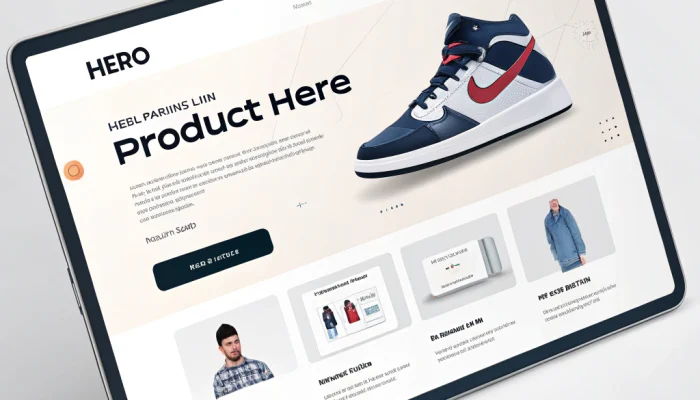
When it comes to online shopping, your homepage is the storefront of your brand. It’s the very first thing customers see, and within seconds, they decide whether to stay or leave. That’s why analyzing ecommerce homepage examples from top-performing brands can give you powerful insights into what works and what doesn’t.
In this detailed guide, we’ll explore some of the best ecommerce homepage examples, break down what makes them successful, and show you how to apply those strategies to your own online store. By the end, you’ll not only know what a winning ecommerce homepage looks like but also how to create one that converts.
“According to Statista, more than 60% of online store traffic now comes from mobile devices, which is why mobile optimization is critical.”
Why Ecommerce Homepages Matter
Before diving into ecommerce homepage examples, let’s understand why this page is so important:
First Impressions Count – 94% of users judge a website based on design within 0.05 seconds.
Navigation Hub – It sets the tone for the shopping experience and guides visitors deeper into your store.
Conversion Gateway – A strong homepage can dramatically reduce bounce rates and increase sales.
In short, your homepage is your digital sales rep, working 24/7.
Key Elements Found in the Best Ecommerce Homepage Examples
Looking at ecommerce homepage examples, we notice recurring elements that almost all successful brands include:
1. Clear Branding
Your homepage must instantly communicate who you are and what you sell.
2. Engaging Visuals
High-quality images, lifestyle photography, and product videos make a homepage inviting.
3. Strong Call-to-Actions (CTAs)
Buttons like “Shop Now,” “Discover More,” or “Limited Offer” drive users to explore products.
4. Intuitive Navigation
A clutter-free, easy-to-use menu improves the shopping journey.
5. Trust Builders
Customer reviews, security badges, and guarantees create confidence.
6. Mobile Optimization
Since more than 60% of traffic is mobile, every homepage must be responsive.

10 Inspiring Ecommerce Homepage Examples
Let’s explore real-world ecommerce homepage examples that stand out:
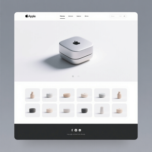
1. Apple – Minimalist & Impactful
Apple’s homepage is a masterclass in simplicity. They use large visuals, minimal text, and strong CTAs.
Why it works:
Clean design keeps the focus on products.
Bold headlines communicate value instantly.
Seamless navigation between categories.
Lesson: Sometimes less is more. A clean design keeps attention on your products.
2. Nike – Emotion-Driven Design
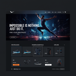
Nike uses powerful visuals and inspirational messaging to connect emotionally with visitors.
Why it works:
Hero images with athletes wearing their products.
Dynamic product highlights.
Personalized recommendations.
Lesson: Emotion sells. Build a lifestyle narrative on your homepage.
3. Amazon – Personalized Shopping
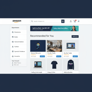
Amazon’s homepage changes dynamically based on user behavior.
Why it works:
Product recommendations tailored to past searches.
Promotions highlighted at the top.
Easy access to deals.
Lesson: Personalization can increase conversions significantly.
4. Sephora – Beauty Meets Function
Sephora balances visuals with usability.
Why it works:
Vibrant imagery showcasing beauty products.
Interactive product sections.
Loyalty program highlights.
Lesson: Feature rewards and offers upfront to encourage engagement.
5. Warby Parker – Customer-Friendly Approach
Warby Parker focuses on solving buyer hesitations.
Why it works:
Clear USP: Affordable, stylish eyewear.
Try-at-home feature highlighted.
Trust elements like reviews & guarantees.
Lesson: Address customer concerns directly on your homepage.
6. Glossier – Social Proof in Action
Glossier heavily uses community-driven content.
Why it works:
Instagram photos integrated on homepage.
Testimonials and reviews front and center.
Simple navigation.
Lesson: Leverage UGC (user-generated content) to build trust.
7. IKEA – Organized Experience
IKEA’s homepage is structured to guide customers effectively.
Why it works:
Well-organized product categories.
Featured seasonal collections.
Easy-to-find offers.
Lesson: Structure matters – make shopping easy for your users.
8. Allbirds – Eco-Friendly Storytelling
Allbirds focuses on its sustainability mission.
Why it works:
Eco-friendly branding clear from first glance.
Clean, nature-inspired visuals.
Storytelling integrated into design.
Lesson: A strong brand mission can differentiate you.
9. ASOS – Trend-Driven Layout
ASOS highlights new arrivals and trending items.
Why it works:
Daily refreshed homepage sections.
Large hero banners with promotions.
Youth-focused visuals.
Lesson: Keep your homepage fresh and relevant.
10. Zara – Visual-First Minimalism
Zara embraces editorial-style photography.
Why it works:
Fashion magazine-inspired visuals.
Minimal navigation to keep focus on collections.
Bold seasonal campaigns.
Lesson: Use editorial photography to inspire and influence buyers.
Comparison Table: Ecommerce Homepage Examples Breakdown
Brand | Key Strengths | Homepage Style | Conversion Tactics |
|---|---|---|---|
| Apple | Minimal design, product focus | Clean & modern | Bold CTAs, hero visuals |
| Nike | Emotional appeal, visuals | Dynamic & inspiring | Lifestyle storytelling |
| Amazon | Personalization, deals | Data-driven | AI-powered recommendations |
| Sephora | Vibrant design, usability | Beauty-focused | Loyalty highlights |
| Warby Parker | Solves concerns, trust elements | Friendly & helpful | Try-at-home feature |
| Glossier | UGC, community-driven | Social-first | Reviews + Instagram feed |
| IKEA | Structured, seasonal | Organized | Category navigation |
| Allbirds | Eco-branding, storytelling | Nature-inspired | Mission-driven messaging |
| ASOS | Trendy, youth-focused | Fashion-forward | Daily updates |
| Zara | Editorial visuals, minimal | Fashion magazine | Seasonal promotions |
How to Apply These Ecommerce Homepage Examples to Your Own Store
Now that you’ve seen powerful ecommerce homepage examples, let’s discuss how to apply these strategies:
Step 1: Define Your Brand Voice
Are you luxury, affordable, eco-friendly, or trendy? Your homepage should reflect that.
Step 2: Focus on Visual Storytelling
Use hero banners, lifestyle photos, and product videos to attract attention.
Step 3: Simplify Navigation
A cluttered menu kills conversions. Stick to 5–7 main categories.
Step 4: Highlight CTAs
Guide users clearly with buttons like Shop Now, Explore, or Sign Up.
Step 5: Use Social Proof
Showcase reviews, ratings, testimonials, and UGC.
Step 6: Personalize User Experience
Even simple tools like “Recently Viewed” or “Recommended for You” can increase sales.
“If you’re looking for a professional team to design a high-converting ecommerce homepage, our Web Development Services can help you create a stunning design tailored to your brand.”

FAQs on Ecommerce Homepage Examples
1. What makes a good ecommerce homepage?
A good ecommerce homepage is visually appealing, easy to navigate, mobile-friendly, and focused on conversions.
2. Should I copy ecommerce homepage examples directly?
No. You should take inspiration but always adapt strategies to fit your brand identity.
3. How often should I update my homepage?
At least once a month, or whenever you launch new products, sales, or seasonal campaigns.
4. Do I need professional designers for a great homepage?
Not always. Many website builders like Shopify, WordPress, and Wix offer templates inspired by top ecommerce homepage examples.
5. What is the most important element on an ecommerce homepage?
Your hero section – because it’s the first thing users see and sets the tone for the rest of the site.
Conclusion
Your homepage is more than just a digital storefront – it’s your brand ambassador. By analyzing the best ecommerce homepage examples like Apple, Nike, Amazon, and Glossier, you can see that success comes from a blend of simplicity, visuals, personalization, and trust-building.
The key takeaway? Don’t just design for beauty—design for clarity, trust, and conversions.
Apply these lessons today, and your ecommerce store can transform into a sales-generating machine.
